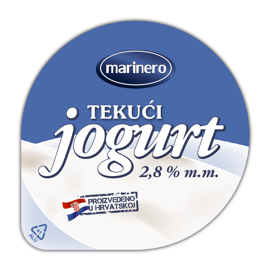
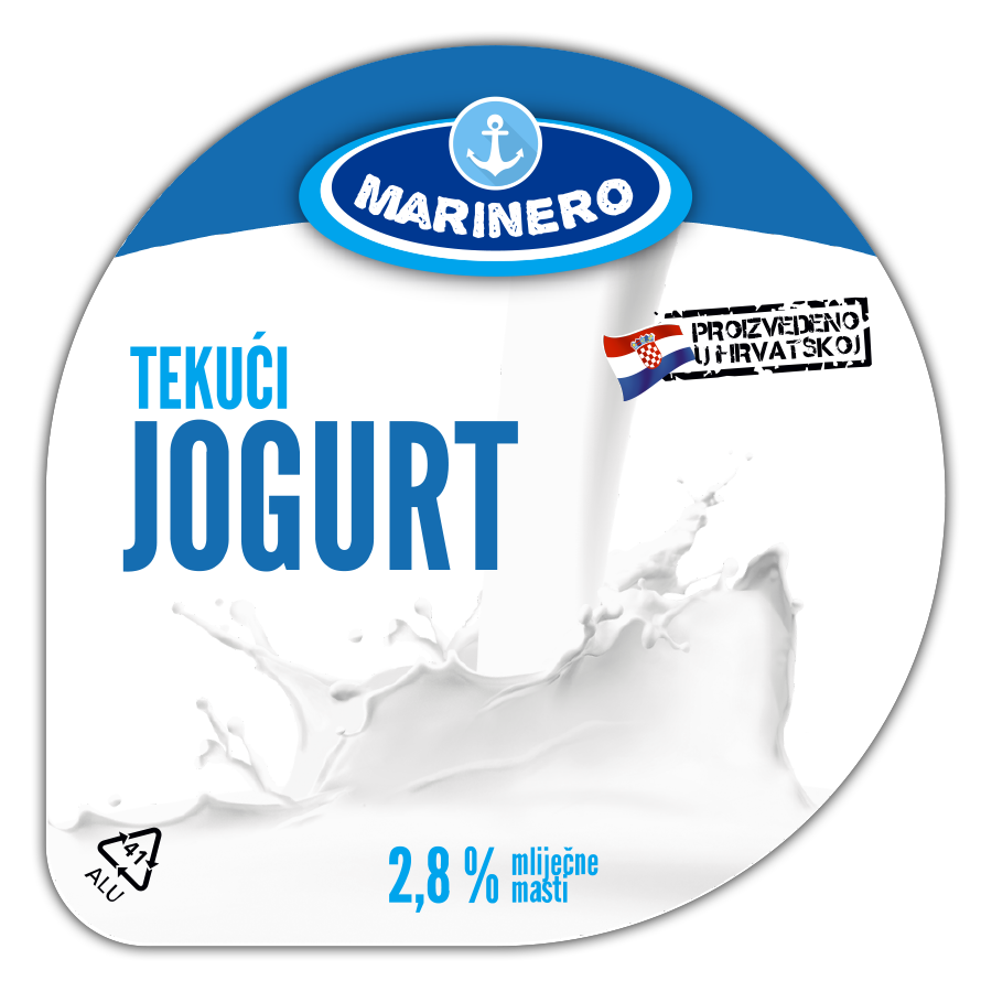
Logo re-thinking

Logo for "Marinero" brand is supposed to be emotionally connected to sailors ("marinero" is a spanish term for sailor), or at least, the ocean, the sea, the waves... The existing logo is not quite on that path. Besides, it was created out of four basic colors (CMYK) and as such, it is very "unstable" when it comes to printing. Different printing techniques, different machines and different suppliers all lead to use of different printing pigments and, accordingly, different printing colors.
A client can now choose between two options, both inadequate, time consuming and expensive: A) to let each printing department to change the logo to match the reference, or B) to let it be printed without any changes but with many different results.

Simplicity with enhanced character

After several different approaches to the above mentioned problem, we decided to go with this solution (to the right). It is much more "naval" than the original logo. Much easier and consistent for printing due to use of only two specified spot colors - PANTONE 661 C (dark blue) and Cyan. We kept the ellipse to preserve the optical and emotional connection with original logo.
With this new logo, we were able to move on and use it as the starting point for a whole new design of the entire product line. Scroll down a bit...

Re-thinking the packaging

Oh, boy... What have we heard during the research for this task! To make the long story short, it was obvious to the customers that we are presenting a yogurt. Because it was written on the lid. But everything else was not that obvious. "This white thing below the title looks like a snow dune". Or, "What is this white-ish stain"? Well, the final conclusion we came up with was that customers prefer precise, direct, unambiguous and, if there is any chance, good looking packaging. They also unanimously demanded a design that "doesn't look cheap". Because, as they stated, "ugly design feels cheap and it all leads to an impression of low quality product".

Let it breath...

Similar to the brand logo case, we decided to give some more character to this yogurt's lid by making it a bit lighter and much more direct in communication with potential customers. Pouring yogurt is now presented with a photo and emphasised against the all white background. The font we used, the colors we used and "pouring yogurt" photo as well, formed a strong and direct impression of the lid and of the product itself. And yet, it stayed within the imaginary boundaries of its price range products.

Bring it on!

Once the basic design is approved, it's easy to play with it on various packaging. A good, fresh design could be inspirational for customers to buy it, but also for the client to start thinking about new products and expanding the existing product line. Being well recognisable, easy to spot on the shelves, fresh and with upgraded communication level, such product lines and products within are capable of raising sales in very short terms.
Check our 3D models for this example: yogurt cup or yogurt bottle.

*When opening in Acrobat click on "Options" in top right corner and choose "Trust this document always".
After that, click anywhere on the page to allow your Acrobat to show 3D content.
**Most browsers would not show 3D content within browser's PDF-reader plug-in. You really need to download it in order to see it.